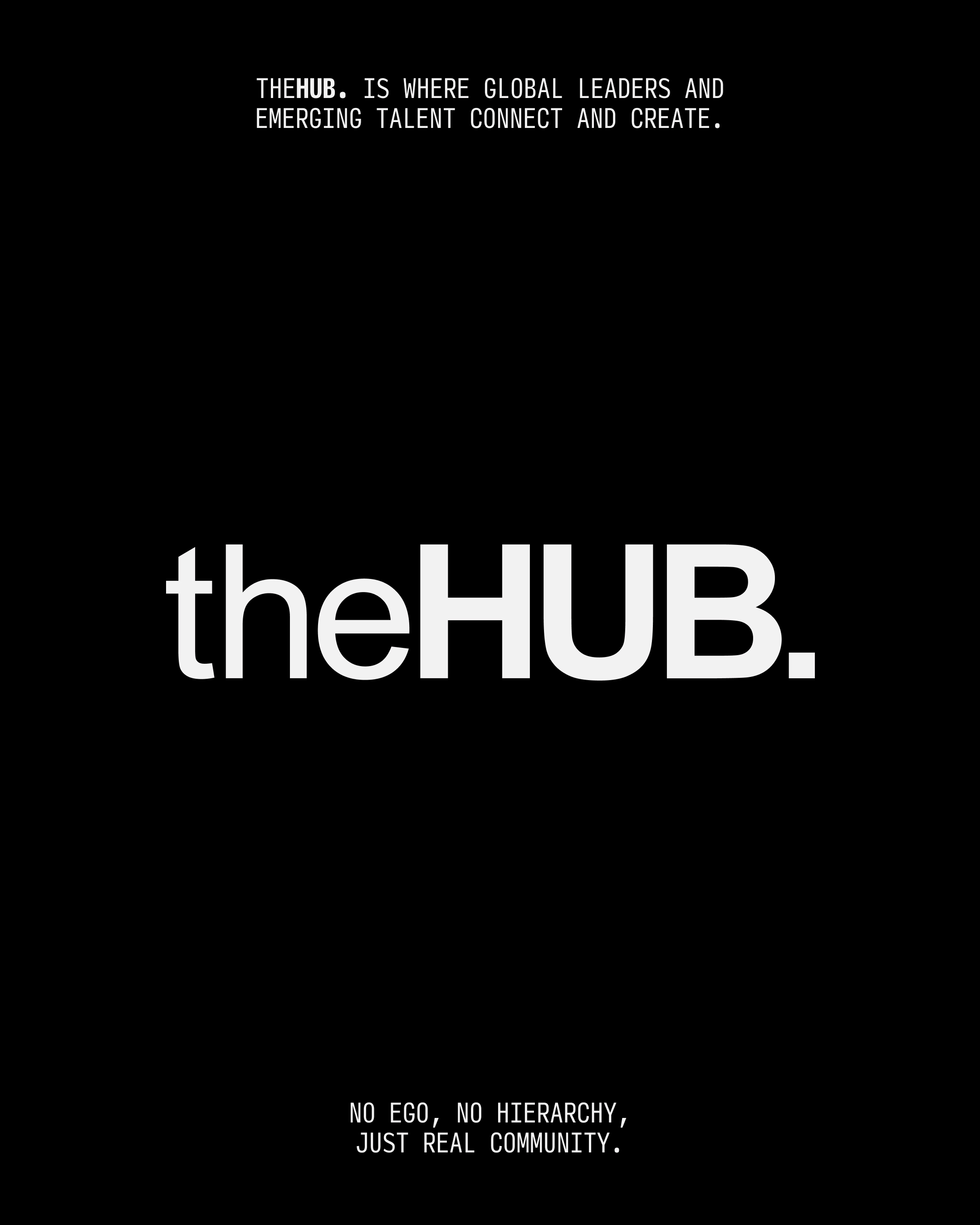
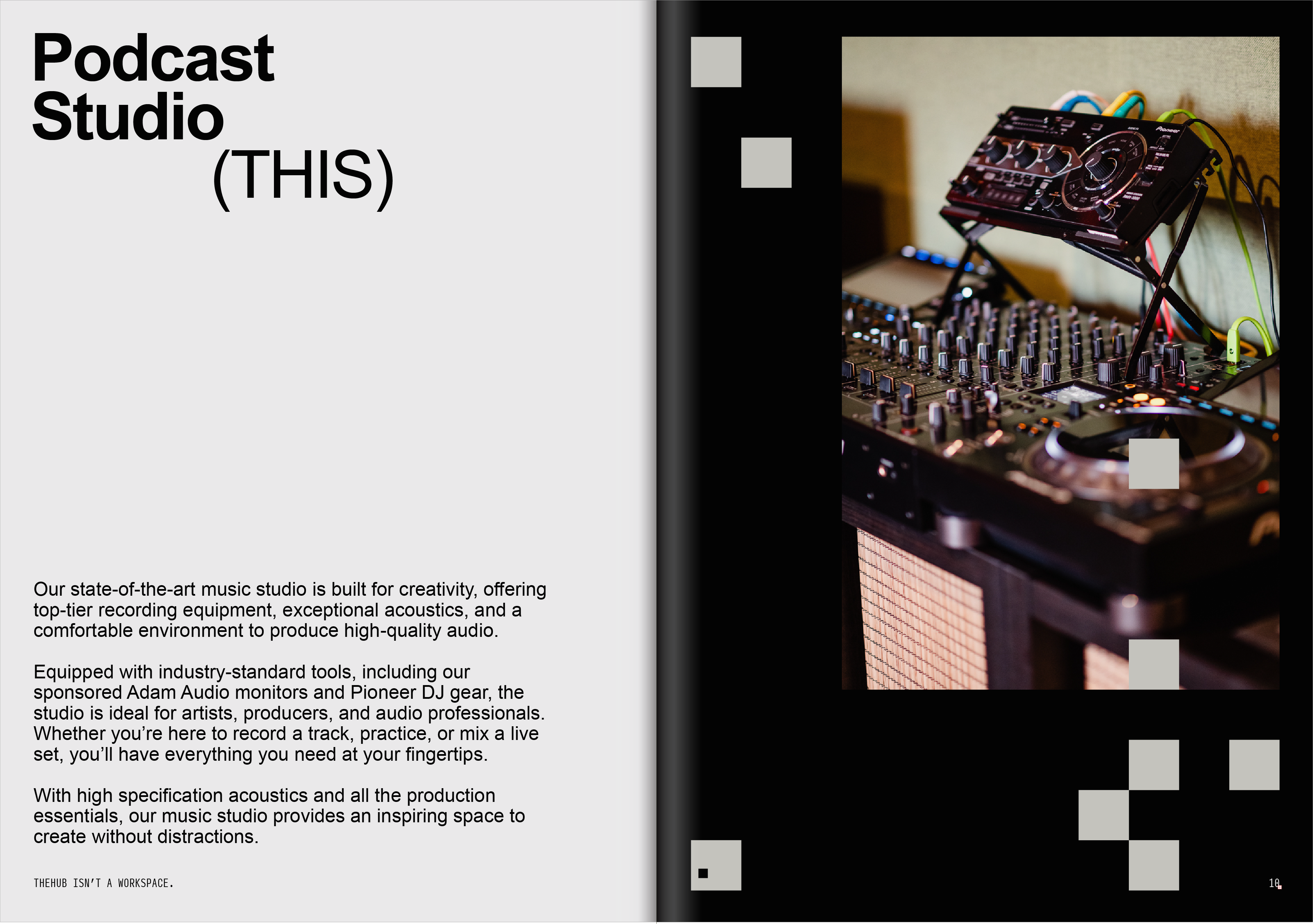
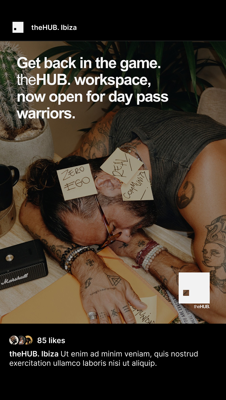
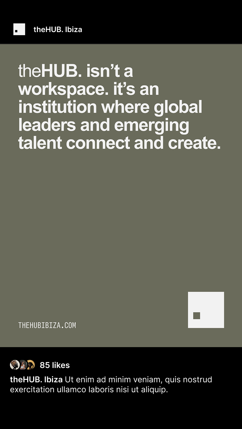
theHUB is one of Ibiza’s most defining member-driven workspaces, a creative ecosystem where coworking, private offices, and fully equipped music studios come together under one roof. A space where global leaders and emerging talent don’t just meet, they collaborate, grow, and produce their best work.
TheHUB emphasises community, with features like shared workspaces, a café, and networking events. It is a place where ego is left at the door, where you create work that doesn’t just change your industry, it redefines it entirely.
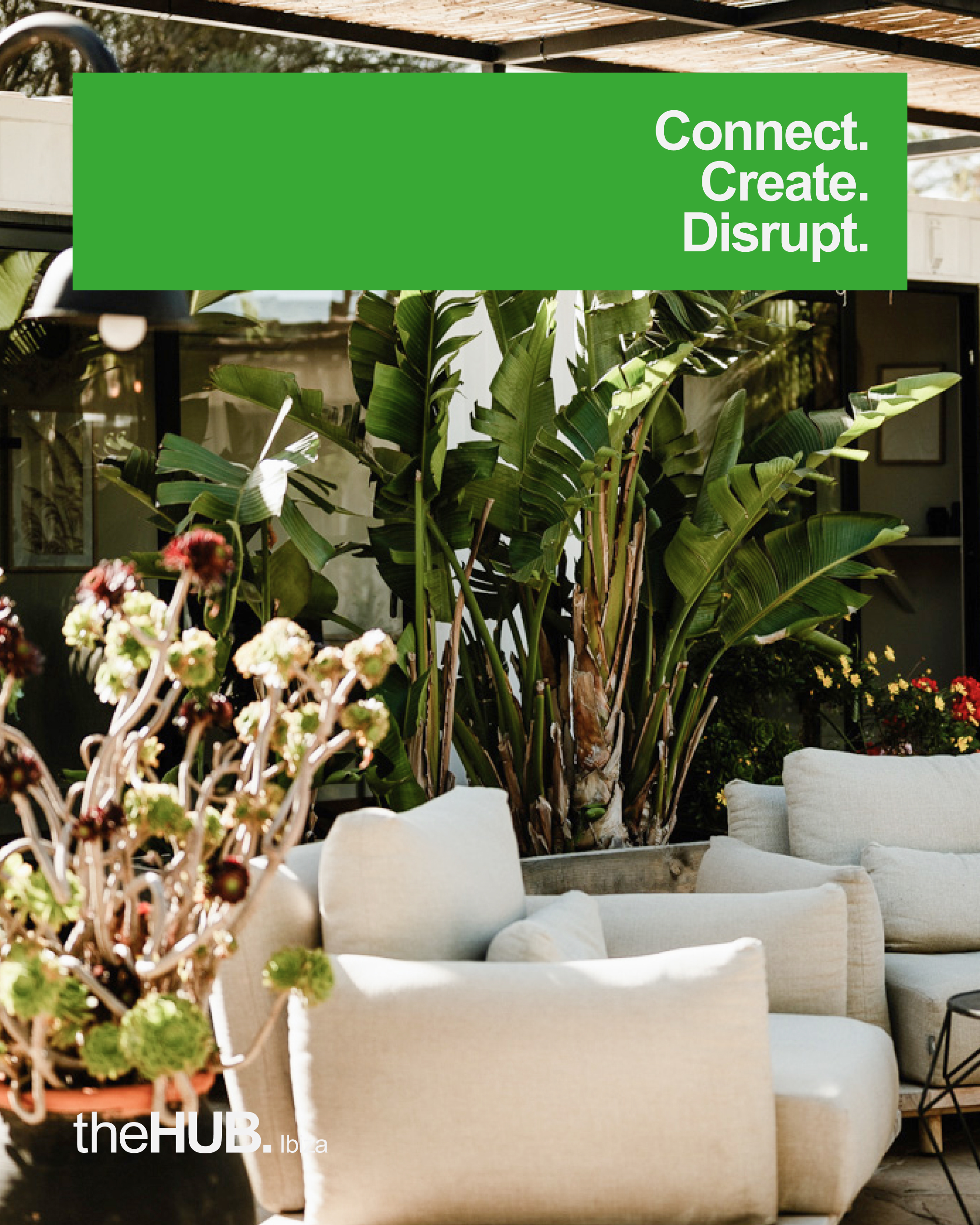
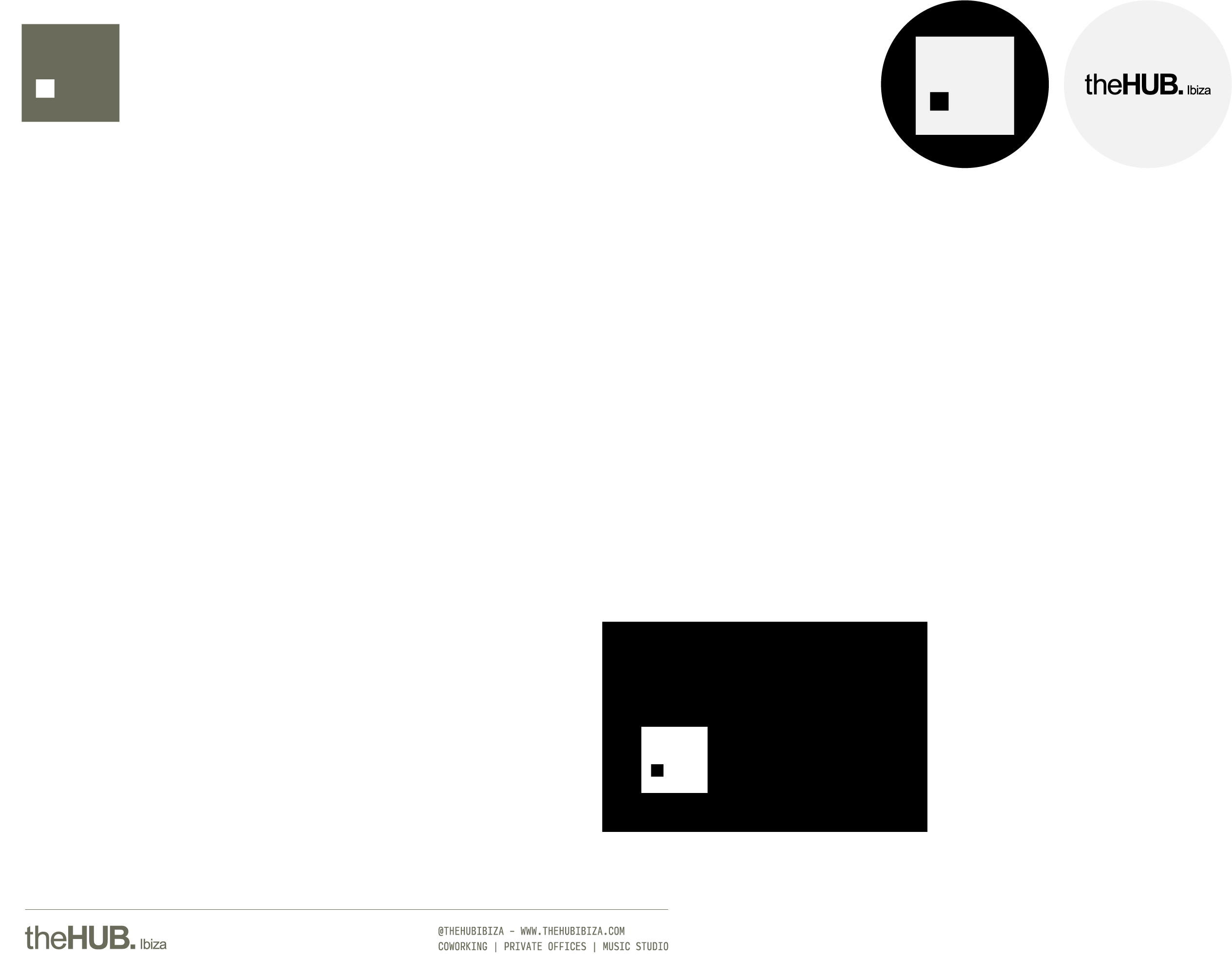
Working alongside strategist Connie Hollyer and theHUB team, Rudy de Souza led a redesign of the existing visual identity. The result is a bold, minimalist system that honours the original logotype and typeface while elevating the brand into a more contemporary space. The refreshed identity introduces a new brand icon, refined colour palette, art direction, and a re-engineered typographic structure, all of which translated into a cohesive series of digital and print assets that reflects theHUB’s new positioning and emphasises theHUB as Ibiza’s leading workspace and creative community.
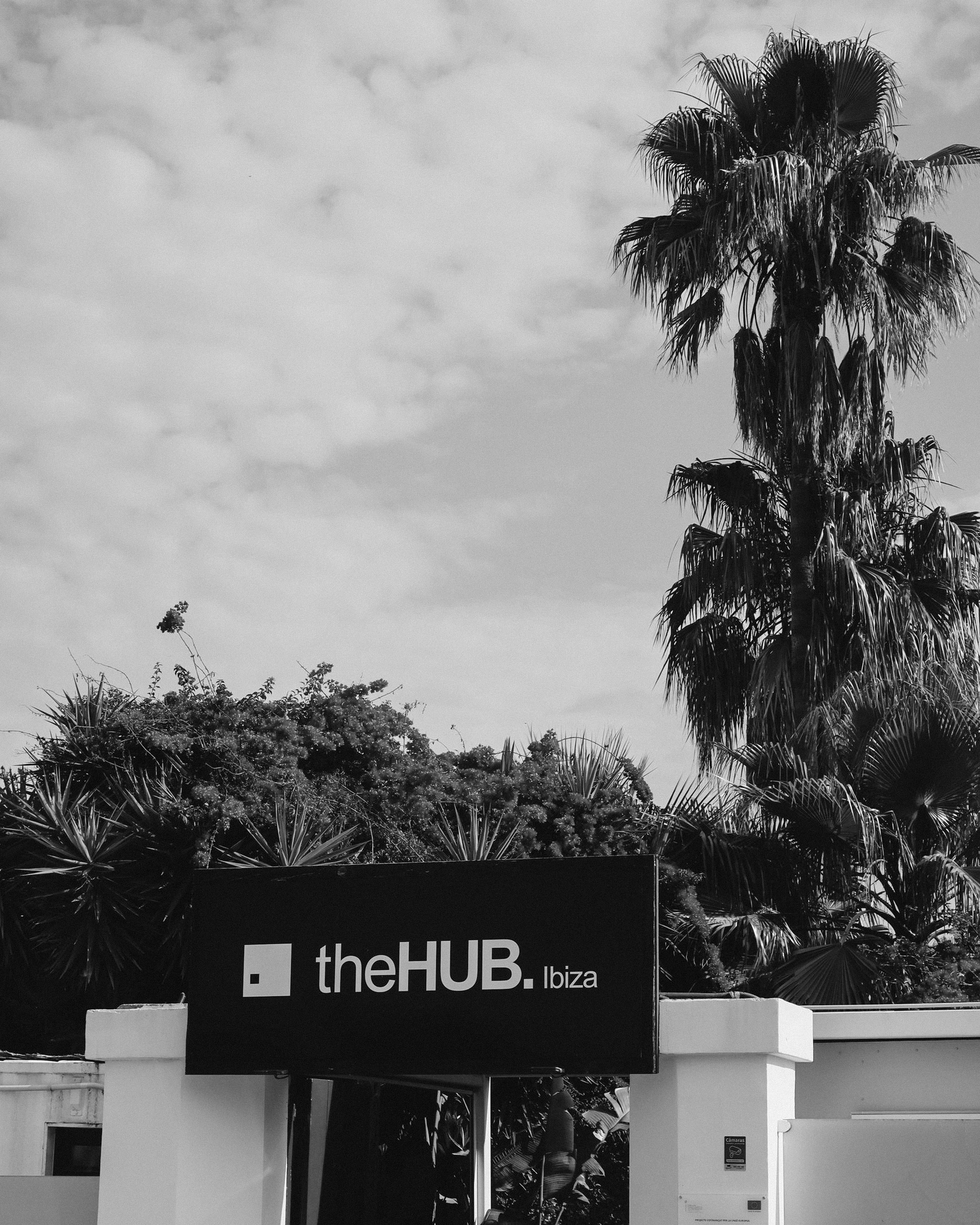
The new icon, immediately recognisable and deeply rooted in theHUB’s original logo, is designed to sit seamlessly within the updated identity. It brings a contemporary yet timeless character to the brand, establishing a visual symbol that feels both iconic and unmistakably theHUB.